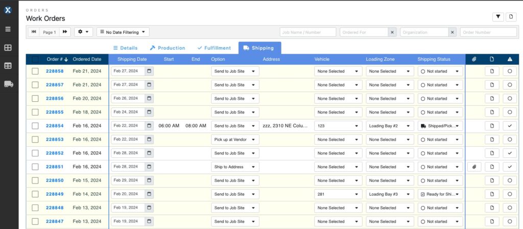
What started out many years ago as a simple listing of all work orders has morphed into a very large and complex Work Order listing page with tons of must-have information for different stakeholders. During its evolution, we’ve tried to keep the Work Order page organized and manageable as we’ve added new features and new data.
In adding the expanded features for shipping and delivery, we came to the conclusion we’ve hit a saturation point where there is simply too much information and functionality to put on a single page view.

To solve the problem and build for the future, we are rolling out a re-designed Work Order main page, simplifying the landing page and introducing tabs for specific workflows such as Production, Shipping, and Fulfillment. Each tab is designed to show all the relevant information and functionality people working in those areas need to see while continuing to provide access to all work order details. The architecture of the new Work Order pages will also make it much faster and easier to use on tablets and mobile phones.
Over February and March, we’ll be rolling out the new version to select clients to get feedback and make any additional improvements. If you’d like to be involved in testing the new version before it is released to everyone, please email [email protected] ■


